# Buttons
[Buttons](https://material.io/components/buttons/) allow users to take actions, and make choices, with a single tap.
There are four types of buttons:
1. [Text button](#text-button)
2. [Outlined button](#outlined-button)
3. [Contained button](#contained-button)
4. [Toggle button](#toggle-button)
**Note: Toggle buttons are implemented using the `mdc-icon-button` component.
For more information, see the [`mdc-icon-button` page](../mdc-icon-button).**

## Using buttons
### Installation
```
npm install @material/button
```
### Styles
```scss
@use "@material/button/styles";
```
### JavaScript instantiation
The button will work without JavaScript, but you can enhance it to have a ripple effect by instantiating `MDCRipple` on the root element. See [MDC Ripple](../mdc-ripple) for details.
```js
import {MDCRipple} from '@material/ripple';
const buttonRipple = new MDCRipple(document.querySelector('.mdc-button'));
```
**Note: See [Importing the JS component](../../docs/importing-js.md) for more information on how to import JavaScript.**
### Making buttons accessible
Material Design spec advises that touch targets should be at least 48 x 48 px.
To meet this requirement, add the following to your button:
```html
```
**Note: The outer `mdc-touch-target-wrapper` element is only necessary if you want to avoid potentially overlapping touch targets on adjacent elements (due to collapsing margins).**
The `mdc-button__focus-ring` element ensures that a focus indicator is displayed in high contrast mode around the active/focused button.
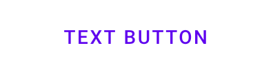
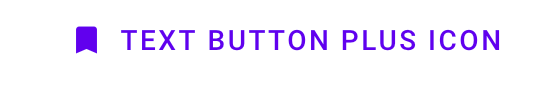
## Text button
[Text buttons](https://material.io/components/buttons/#text-button) are typically used for less-pronounced actions, including those located in dialogs and cards. In cards, text buttons help maintain an emphasis on card content.
### Text button example
```html
```
Text button with icon example
```html
```
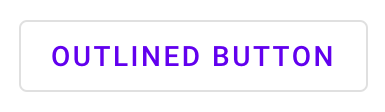
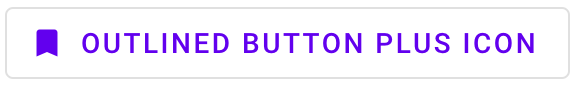
## Outlined button
[Outlined buttons](https://material.io/components/buttons/#outlined-button) are medium-emphasis buttons. They contain actions that are important, but aren’t the primary action in an app.
### Outlined button example
```html
```
Outlined button with icon example
```html
```
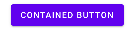
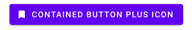
## Contained button
[Contained buttons](https://material.io/components/buttons/#contained-button) are high-emphasis, distinguished by their use of elevation and fill. They contain actions that are primary to your app.
### Contained button example
```html
```
**Note: `mdc-button--raised` is applied for a contained button with elevation,
and `mdc-button--unelevated` is applied for a contained button flush with the surface.**
Contained button with icon example
```html
```
## Toggle button
[Toggle buttons](https://material.io/components/buttons/#toggle-button) can be used to select from a group of choices.
There are two types of toggle buttons:
* [Toggle button](#toggle-button)
* [Icon](#icon)
MDC Web currently does not support toggle button groups.
### Icon
Icons can be used as toggle buttons when they allow selection, or deselection, of a single choice, such as marking an item as a favorite.
For more details, see the [`mdc-icon-button` page](../mdc-icon-button).
## Other Variants
### Icon
We recommend using [Material Icons](https://material.io/tools/icons/) from Google Fonts:
```html
```
However, you can also use SVG, [Font Awesome](https://fontawesome.com/), or any other icon library you wish.
To add an icon, add an element with the `mdc-button__icon` class inside the button element and set the attribute `aria-hidden="true"`. The icon is set to 18px to meet legibility requirements.
```html
```
It's also possible to use an SVG icon:
```html
```
#### Trailing Icon
Certain icons make more sense to appear after the button's text label rather than before. This can be accomplished by
putting the icon markup _after_ the `mdc-button__label` element.
```html
```
**Note: The `mdc-button__label` element is _required_ in order for the trailing icon to be styled appropriately.**
### Disabled
To disable a button, add the `disabled` attribute directly to the `
 ```html
```
Text button with icon example
```html
```
Text button with icon example
 ```html
```
## Outlined button
[Outlined buttons](https://material.io/components/buttons/#outlined-button) are medium-emphasis buttons. They contain actions that are important, but aren’t the primary action in an app.
### Outlined button example
```html
```
## Outlined button
[Outlined buttons](https://material.io/components/buttons/#outlined-button) are medium-emphasis buttons. They contain actions that are important, but aren’t the primary action in an app.
### Outlined button example
 ```html
```
Outlined button with icon example
```html
```
Outlined button with icon example
 ```html
```
## Contained button
[Contained buttons](https://material.io/components/buttons/#contained-button) are high-emphasis, distinguished by their use of elevation and fill. They contain actions that are primary to your app.
### Contained button example
```html
```
## Contained button
[Contained buttons](https://material.io/components/buttons/#contained-button) are high-emphasis, distinguished by their use of elevation and fill. They contain actions that are primary to your app.
### Contained button example
 ```html
```
**Note: `mdc-button--raised` is applied for a contained button with elevation,
and `mdc-button--unelevated` is applied for a contained button flush with the surface.**
Contained button with icon example
```html
```
**Note: `mdc-button--raised` is applied for a contained button with elevation,
and `mdc-button--unelevated` is applied for a contained button flush with the surface.**
Contained button with icon example
 ```html
```
## Toggle button
[Toggle buttons](https://material.io/components/buttons/#toggle-button) can be used to select from a group of choices.
There are two types of toggle buttons:
* [Toggle button](#toggle-button)
* [Icon](#icon)
```html
```
## Toggle button
[Toggle buttons](https://material.io/components/buttons/#toggle-button) can be used to select from a group of choices.
There are two types of toggle buttons:
* [Toggle button](#toggle-button)
* [Icon](#icon)
 MDC Web currently does not support toggle button groups.
### Icon
Icons can be used as toggle buttons when they allow selection, or deselection, of a single choice, such as marking an item as a favorite.
For more details, see the [`mdc-icon-button` page](../mdc-icon-button).
## Other Variants
### Icon
We recommend using [Material Icons](https://material.io/tools/icons/) from Google Fonts:
```html
```
However, you can also use SVG, [Font Awesome](https://fontawesome.com/), or any other icon library you wish.
To add an icon, add an element with the `mdc-button__icon` class inside the button element and set the attribute `aria-hidden="true"`. The icon is set to 18px to meet legibility requirements.
```html
```
It's also possible to use an SVG icon:
```html
```
#### Trailing Icon
Certain icons make more sense to appear after the button's text label rather than before. This can be accomplished by
putting the icon markup _after_ the `mdc-button__label` element.
```html
```
**Note: The `mdc-button__label` element is _required_ in order for the trailing icon to be styled appropriately.**
### Disabled
To disable a button, add the `disabled` attribute directly to the `
MDC Web currently does not support toggle button groups.
### Icon
Icons can be used as toggle buttons when they allow selection, or deselection, of a single choice, such as marking an item as a favorite.
For more details, see the [`mdc-icon-button` page](../mdc-icon-button).
## Other Variants
### Icon
We recommend using [Material Icons](https://material.io/tools/icons/) from Google Fonts:
```html
```
However, you can also use SVG, [Font Awesome](https://fontawesome.com/), or any other icon library you wish.
To add an icon, add an element with the `mdc-button__icon` class inside the button element and set the attribute `aria-hidden="true"`. The icon is set to 18px to meet legibility requirements.
```html
```
It's also possible to use an SVG icon:
```html
```
#### Trailing Icon
Certain icons make more sense to appear after the button's text label rather than before. This can be accomplished by
putting the icon markup _after_ the `mdc-button__label` element.
```html
```
**Note: The `mdc-button__label` element is _required_ in order for the trailing icon to be styled appropriately.**
### Disabled
To disable a button, add the `disabled` attribute directly to the `