
 wpfat23-7
44a43ea56d
init commit (frontend and backend)
wpfat23-7
44a43ea56d
init commit (frontend and backend)
|
2 лет назад | |
|---|---|---|
| .. | ||
| dist | 2 лет назад | |
| images | 2 лет назад | |
| CHANGELOG.md | 2 лет назад | |
| LICENSE | 2 лет назад | |
| README.md | 2 лет назад | |
| _index.scss | 2 лет назад | |
| _slider-theme.scss | 2 лет назад | |
| _slider.scss | 2 лет назад | |
| adapter.d.ts | 2 лет назад | |
| adapter.js | 2 лет назад | |
| adapter.js.map | 2 лет назад | |
| component.d.ts | 2 лет назад | |
| component.js | 2 лет назад | |
| component.js.map | 2 лет назад | |
| constants.d.ts | 2 лет назад | |
| constants.js | 2 лет назад | |
| constants.js.map | 2 лет назад | |
| foundation.d.ts | 2 лет назад | |
| foundation.js | 2 лет назад | |
| foundation.js.map | 2 лет назад | |
| index.d.ts | 2 лет назад | |
| index.js | 2 лет назад | |
| index.js.map | 2 лет назад | |
| package.json | 2 лет назад | |
| styles.scss | 2 лет назад | |
| types.d.ts | 2 лет назад | |
| types.js | 2 лет назад | |
| types.js.map | 2 лет назад | |
README.md
Slider
Sliders allow users to make selections from a range of values.
The MDC Slider implementation supports both single point sliders (one thumb)
and range sliders (two thumbs). It is backed by the browser
<input type="range"> element, is fully accessible, and is RTL-aware.
Contents
Using sliders
Installing sliders
npm install @material/slider
Styles
@use "@material/slider/styles";
JavaScript instantiation
import {MDCSlider} from '@material/slider';

const slider = new MDCSlider(document.querySelector('.mdc-slider'));
Note: See Importing the JS component for more information on how to import JavaScript.
Making sliders accessible
Sliders are backed by an <input> element, meaning that they are fully
accessible. Unlike the ARIA-based slider,
MDC sliders are adjustable using touch-based assistive technologies such as
TalkBack on Android.
Per the spec, ensure that the following attributes are added to the
input element(s):
value: Value representing the current value.min: Value representing the minimum allowed value.max: Value representing the maximum allowed value.aria-labeloraria-labelledby: Accessible label for the slider.
If the value is not user-friendly (e.g. a number to represent the day of the week), also set the following:
aria-valuetext: Set this input attribute to a string that makes the slider value understandable, e.g. 'Monday'.- Add a function to map the slider value to
aria-valuetextvia theMDCSlider#setValueToAriaValueTextFnmethod.
Sliders
There are two types of sliders:
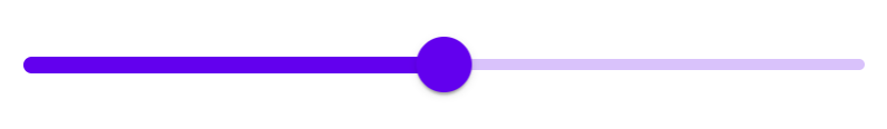
Continuous slider
Continuous sliders allow users to make meaningful selections that don’t require a specific value.
Note: The step size for value quantization is, by default, 1. To specify
a custom step size, provide a value for the step attribute on the input
element.
<div class="mdc-slider">
  <div class="mdc-slider__track">
    <div class="mdc-slider__track--inactive"></div>
    <div class="mdc-slider__track--active">
      <div class="mdc-slider__track--active_fill"></div>
    </div>
  </div>
  <div class="mdc-slider__thumb">
    <div class="mdc-slider__thumb-knob"></div>
    <input class="mdc-slider__input" type="range" min="0" max="100" value="50" name="volume" aria-label="Continuous slider demo">
  </div>
</div>
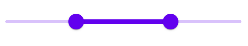
Continuous range slider
Note: By default there's no minimum distance between the two thumbs. To specify
one, provide a value for the data-min-range attribute on the root element and
adjust the min and max attributes on the input elements accordingly.
<div class="mdc-slider mdc-slider--range" data-min-range="10">
  <div class="mdc-slider__track">
    <div class="mdc-slider__track--inactive"></div>
    <div class="mdc-slider__track--active">
      <div class="mdc-slider__track--active_fill"></div>
    </div>
  </div>
  <div class="mdc-slider__thumb">
    <div class="mdc-slider__thumb-knob"></div>
    <input class="mdc-slider__input" type="range" min="0" max="60" value="30" name="rangeStart" aria-label="Continuous range slider demo">
  </div>
  <div class="mdc-slider__thumb">
    <div class="mdc-slider__thumb-knob"></div>
    <input class="mdc-slider__input" type="range" min="40" max="100" value="70" name="rangeEnd" aria-label="Continuous range slider demo">
  </div>
</div>
Discrete slider
Discrete sliders display a numeric value label upon pressing the thumb, which allows a user to select an exact value.

To create a discrete slider, add the following:
mdc-slider--discreteclass on the root element.Value indicator element (
mdc-slider__value-indicator-container), as shown below.<div class="mdc-slider mdc-slider--discrete"> <div class="mdc-slider__track"> <div class="mdc-slider__track--inactive"></div> <div class="mdc-slider__track--active"> <div class="mdc-slider__track--active_fill"></div> </div> </div> <div class="mdc-slider__thumb"> <div class="mdc-slider__value-indicator-container" aria-hidden="true"> <div class="mdc-slider__value-indicator"> <span class="mdc-slider__value-indicator-text"> 50 </span> </div> </div> <div class="mdc-slider__thumb-knob"></div> <input class="mdc-slider__input" type="range" min="0" max="100" value="50" name="volume" step="10" aria-label="Discrete slider demo"> </div> </div>
Discrete slider with tick marks
Discrete sliders can optionally display tick marks. Tick marks represent predetermined values to which the user can move the slider.
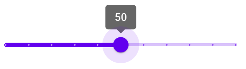
To add tick marks to a discrete slider, add the following:
mdc-slider--tick-marksclass on the root elementmdc-slider__tick-markselement as a child of themdc-slider__trackelementmdc-slider__tick-mark--activeandmdc-slider__tick-mark--inactiveelements as children of themdc-slider__tick-markselement<div class="mdc-slider mdc-slider--discrete mdc-slider--tick-marks"> <div class="mdc-slider__track"> <div class="mdc-slider__track--inactive"></div> <div class="mdc-slider__track--active"> <div class="mdc-slider__track--active_fill"></div> </div> <div class="mdc-slider__tick-marks"> <div class="mdc-slider__tick-mark--active"></div> <div class="mdc-slider__tick-mark--active"></div> <div class="mdc-slider__tick-mark--active"></div> <div class="mdc-slider__tick-mark--active"></div> <div class="mdc-slider__tick-mark--active"></div> <div class="mdc-slider__tick-mark--active"></div> <div class="mdc-slider__tick-mark--inactive"></div> <div class="mdc-slider__tick-mark--inactive"></div> <div class="mdc-slider__tick-mark--inactive"></div> <div class="mdc-slider__tick-mark--inactive"></div> <div class="mdc-slider__tick-mark--inactive"></div> </div> </div> <div class="mdc-slider__thumb"> <div class="mdc-slider__value-indicator-container" aria-hidden="true"> <div class="mdc-slider__value-indicator"> <span class="mdc-slider__value-indicator-text"> 50 </span> </div> </div> <div class="mdc-slider__thumb-knob"></div> <input class="mdc-slider__input" type="range" min="0" max="100" value="50" name="volume" step="10" aria-label="Discrete slider with tick marks demo"> </div> </div>
Discrete range slider
<div class="mdc-slider mdc-slider--range mdc-slider--discrete">
  <div class="mdc-slider__track">
    <div class="mdc-slider__track--inactive"></div>
    <div class="mdc-slider__track--active">
      <div class="mdc-slider__track--active_fill"></div>
    </div>
  </div>
  <div class="mdc-slider__thumb">
    <div class="mdc-slider__value-indicator-container" aria-hidden="true">
      <div class="mdc-slider__value-indicator">
        <span class="mdc-slider__value-indicator-text">
          20
        </span>
      </div>
    </div>
    <div class="mdc-slider__thumb-knob"></div>
    <input class="mdc-slider__input" type="range" min="0" max="50" value="20" step="10" name="rangeStart" aria-label="Discrete range slider demo">
  </div>
  <div class="mdc-slider__thumb">
    <div class="mdc-slider__value-indicator-container" aria-hidden="true">
      <div class="mdc-slider__value-indicator">
        <span class="mdc-slider__value-indicator-text">
          50
        </span>
      </div>
    </div>
    <div class="mdc-slider__thumb-knob"></div>
    <input class="mdc-slider__input" type="range" min="20" max="100" value="50" step="10" name="rangeEnd" aria-label="Discrete range slider demo">
  </div>
</div>
Other variants
Disabled slider
To disable a slider, add the following:
mdc-slider--disabledclass on the root elementdisabledattribute on the input element<div class="mdc-slider mdc-slider--disabled"> <div class="mdc-slider__track"> <div class="mdc-slider__track--inactive"></div> <div class="mdc-slider__track--active"> <div class="mdc-slider__track--active_fill"></div> </div> </div> <div class="mdc-slider__thumb"> <div class="mdc-slider__thumb-knob"></div> <input class="mdc-slider__input" type="range" min="0" max="100" value="50" step="10" disabled name="volume" aria-label="Disabled slider demo"> </div> </div>
Additional information
Initialization with custom ranges and values
When MDCSlider is initialized, it reads the input element's min,
max, and value attributes if present, using them to set
the component's internal min, max, and value properties.
Use these attributes to initialize the slider with a custom range and values, as shown below:
<div class="mdc-slider">
  <!-- ... -->
  <div class="mdc-slider__thumb">
    <!-- ... -->
    <input class="mdc-slider__input" aria-label="Slider demo" min="0" max="100" value="75">
  </div>
</div>
Setting slider position before component initialization
When MDCSlider is initialized, it updates the slider track and thumb
positions based on the internal value(s). To set the correct track and thumb
positions before component initialization, mark up the DOM as follows:
- Calculate
rangePercentDecimal, the active track range as a percentage of the entire track, i.e.(valueEnd - valueStart) / (max - min). Settransform:scaleX(<rangePercentDecimal>)as an inline style on themdc-slider__track--active_fillelement. - Calculate
thumbEndPercent, the initial position of the end thumb as a percentage of the entire track. Setleft:calc(<thumbEndPercent>% - 24px)as an inline style on the end thumb (mdc-slider__thumb) element (orrightfor RTL layouts). - [Range sliders only] Calculate
thumbStartPercent, the initial position of the start thumb as a percentage of the entire track. Setleft:calc(<thumbStartPercent>% - 24px)as an inline style on the start thumb (mdc-slider__thumb) element (orrightfor RTL layouts). - [Range sliders only] Using the previously calculated
thumbStartPercent, setleft:<thumbStartPercent>%as an inline style on themdc-slider__track--active_fillelement (orrightfor RTL layouts).
Additionally, the MDCSlider component should be initialized with
skipInitialUIUpdate set to true.
Range slider example
This is an example of a range slider with internal values of
[min, max] = [0, 100] and [start, end] = [30, 70], and a minimum range of
10.
<div class="mdc-slider mdc-slider--range" data-min-range="10">
  <div class="mdc-slider__track">
    <div class="mdc-slider__track--inactive"></div>
    <div class="mdc-slider__track--active">
      <div class="mdc-slider__track--active_fill"
           style="transform:scaleX(.4); left:30%"></div>
    </div>
  </div>
  <div class="mdc-slider__thumb" style="left:calc(30%-24px)">
    <div class="mdc-slider__thumb-knob"></div>
    <input class="mdc-slider__input" type="range" min="0" max="60" value="30" name="rangeStart" aria-label="Range slider demo">
  </div>
  <div class="mdc-slider__thumb" style="left:calc(70%-24px)">
    <div class="mdc-slider__thumb-knob"></div>
    <input class="mdc-slider__input" type="range" min="40" max="100" value="70" name="rangeEnd" aria-label="Range slider demo">
  </div>
</div>
API
Sass mixins
| Mixin | Description |
|---|---|
track-active-color($color) |
Sets the color of the active track. |
track-inactive-color($color, $opacity) |
Sets the color and opacity of the inactive track. |
thumb-color($color) |
Sets the color of the thumb. |
thumb-ripple-color($color) |
Sets the color of the thumb ripple. |
tick-mark-active-color($color) |
Sets the color of tick marks on the active track. |
tick-mark-inactive-color($color) |
Sets the color of tick marks on the inactive track. |
value-indicator-color($color, $opaicty) |
Sets the color and opacity of the value indicator. |
value-indicator-text-color($color, $opaicty) |
Sets the color of the value indicator text. |
MDCSlider events
| Event name | event.detail |
Description |
|---|---|---|
MDCSlider:change |
MDCSliderChangeEventDetail |
Emitted when a value has been changed and committed from a user event. Mirrors the native change event: https://developer.mozilla.org/en-US/docs/Web/API/HTMLElement/change_event |
MDCSlider:input |
MDCSliderChangeEventDetail |
Emitted when a value has been changed from a user event. Mirrors the native input event: https://developer.mozilla.org/en-US/docs/Web/API/HTMLElement/input_event |
MDCSlider methods
| Method Signature | Description |
|---|---|
getValueStart() => number |
Gets the value of the start thumb (only applicable for range sliders). |
setValueStart(valueStart: number) => void |
Sets the value of the start thumb (only applicable for range sliders). |
getValue() => number |
Gets the value of the thumb (for single point sliders), or the end thumb (for range sliders). |
setValue(value: number) => void |
Sets the value of the thumb (for single point sliders), or the end thumb (for range sliders). |
getDisabled() => boolean |
Gets the disabled state of the slider. |
setDisabled(disabled: boolean) => void |
Sets the disabled state of the slider. |
setValueToAriaValueTextFn((mapFn: ((value: number) => string) \| null) => void |
Sets a function that maps the slider value to value of the aria-valuetext attribute on the thumb element. If not set, the aria-valuetext attribute is unchanged when the value changes. |
Usage within frameworks
If you are using a JavaScript framework such as React or Angular, you can create a slider for your framework. Depending on your needs, you can use the Simple Approach: Wrapping MDC Web Vanilla Components, or the Advanced Approach: Using Foundations and Adapters. Please follow the instructions here.
See MDCSliderAdapter and MDCSliderFoundation for up-to-date code documentation of slider foundation API's.